


Introduction to Media-Query
Media queries are a feature of CSS that allows you to apply different styles to a webpage based on the characteristics of the device it is being displayed on. This can be useful for creating responsive designs that look good on a variety of different devices, such as smartphones, tablets, and desktop computers.
Advantages of using media queries in your web development projects:
Responsive design
Customized user experience
Improved performance
Enhanced accessibility
Simplified maintenance
In some cases, websites may not support small screens because the website's functionality and features are not optimized for small screens. In such cases, the best user experience might be achieved by providing a separate mobile-friendly version of the message telling our website doesn’t support small screens. Media queries have become popular for several reasons:
● The increasing number of devices.
● The rise of mobile browsing.
● Improving User Experience.
● Better accessibility.
● Better Performance.
● Print Supp
<!DOCTYPE html>
<html lang="en">
<head>
    <meta charset="UTF-8">
    <meta http-equiv="X-UA-Compatible" content="IE=edge">
    <meta name="viewport" content="width=device-width, initial-scale=1.0">
    <title>Media_Query</title>
    <link rel="stylesheet" href="media_Q.css">
</head>
<body>
    <p></p>
</body>
</html>
body{
background-image: radial-gradient(blue,pink);
}
p{
color: black;
text-align: center;
font-size: xx-large;
height: 1000px;
}
p::after{
content: 'PHONE DISPLAY';
}
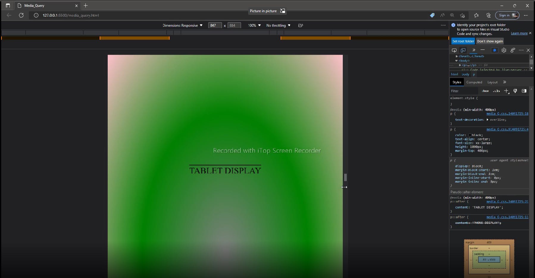
@media (min-width : 400px){
body{
background-image: radial-gradient(grey,green,pink);
}
p{
text-decoration: overline;
}
p::after{
content: 'TABLET DISPLAY';
}
}
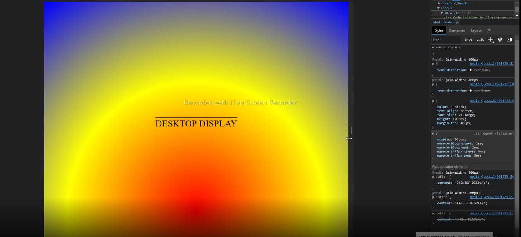
@media (min-width : 900px){
body{
background-image: radial-gradient(circle,red,yellow,blue);
}
p{
text-decoration: overline;
}
p::after{
content: 'DESKTOP DISPLAY';
}
}
#CSS #HTML